Our villagers get to be involved in some amazing projects with awesome clients and this month we’re shining a spotlight on Bron Alexander - a designer and illustrator based in Hamilton. As you’ll see from the work below, she is just incredible! And we’re so proud to have her here on The Freelance Village.

Here's two of her most recent projects, and if you want to see more, head to her website Bron Alexander Design.
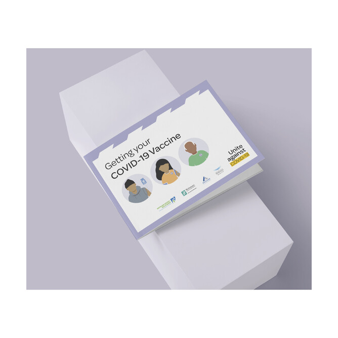
AUCKLAND DHB - Illustrated Covid Brochure
I work really closely with a fantastic (also freelance) Comms person (shout out to Comms Manager extraordinaire Lee Cowan). She is highly skilled, and just a wonderful human being and I am very lucky to work so much with her.
While Lee was contracting to the Auckland District Health Board, she needed a designer/illustrator to craft a brochure to disseminate amongst some of our most vulnerable community members. The brochure needed to illustrate the process of getting a Covid-19 vaccination and so Lee reached out to me to do it.
The brochure had to avoid illustrations of needles, incorporate elements of the New
Zealand Covid-19 branding collateral and illustrate the characters in respectful manner, to be honest I didn't know if I could do it justice originally!
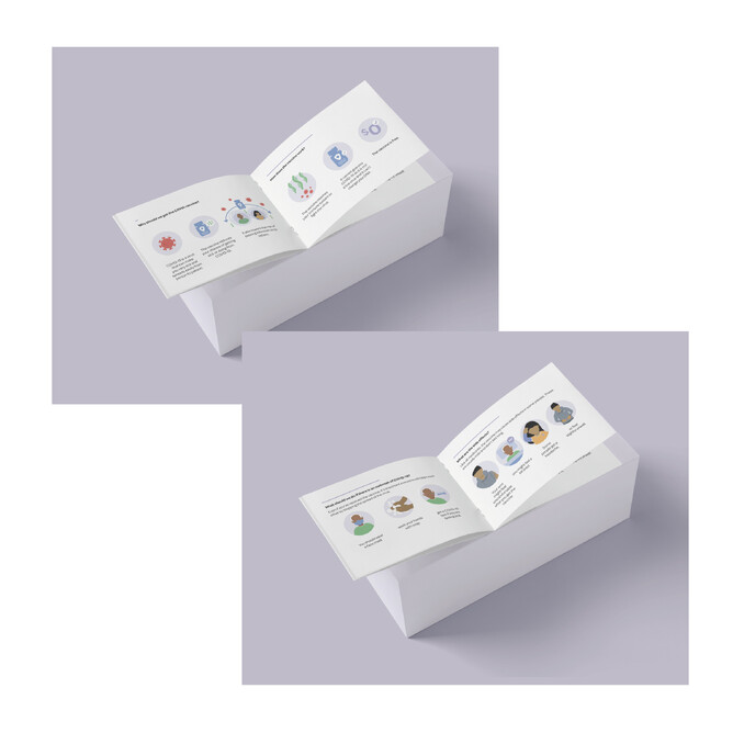
In the end I used a lot of existing iconography for Covid-19 related images within the document, and focused on creating an extremely pared back illustration style to highlight some of the more important details that the messaging needed to get across visually.
While I created faceless images to match with other existing Covid-19 symptom posters, the feedback from some in the community was that the missing facial details actually made the characters a little scary - so like with a lot of projects something really important was learnt
along the way, and I am better informed as a designer.
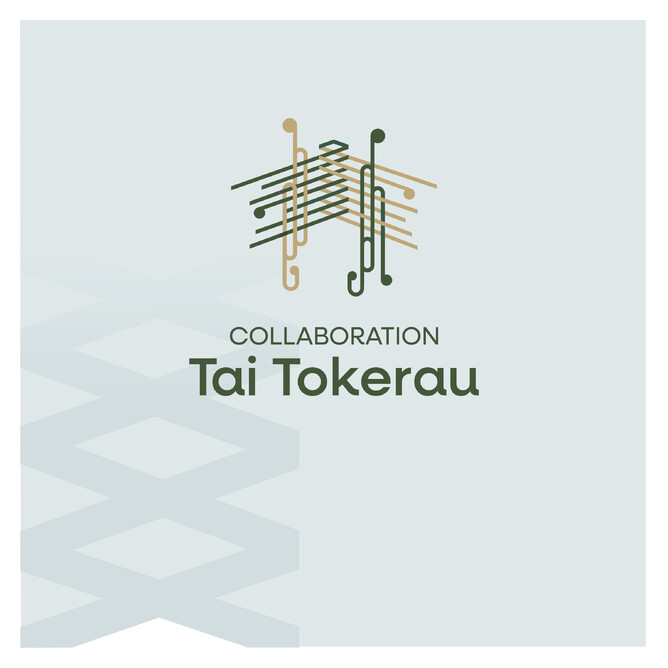
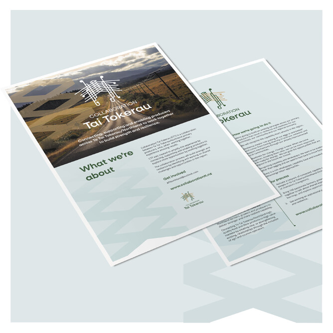
COLLABORATE TAI TOKERAU - Brand, print and web design.
Again working with freelance Comms Manager Lee Cowan, we were tasked with building a brand from the ground-up for a community led organisation based in Northland/Tai Tokerau.
The brief for this project was quite open creatively giving me the space to really dig deep into the project and what it meant for the community, with the benefit of having been involved with designing for a similar organisation called Thriving Southland for the last year. The brand needed to convey a lot of different messages, and the risk for me was to be too literal in translating it.
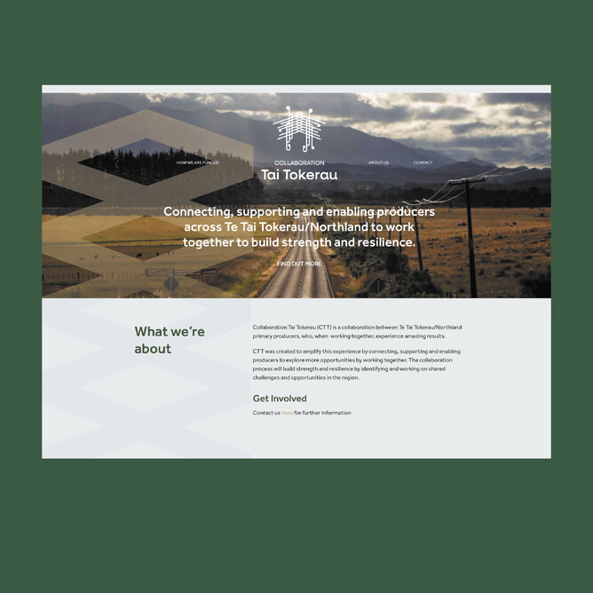
Ultimately the logo I created, along with the brand colours and imagery resulted in the client telling me that the brand "felt like home", which was feedback I was so happy to get! Customising Rocketspark's template to my clients brand made my life so easy and my client is so happy with the result!